Branding Design
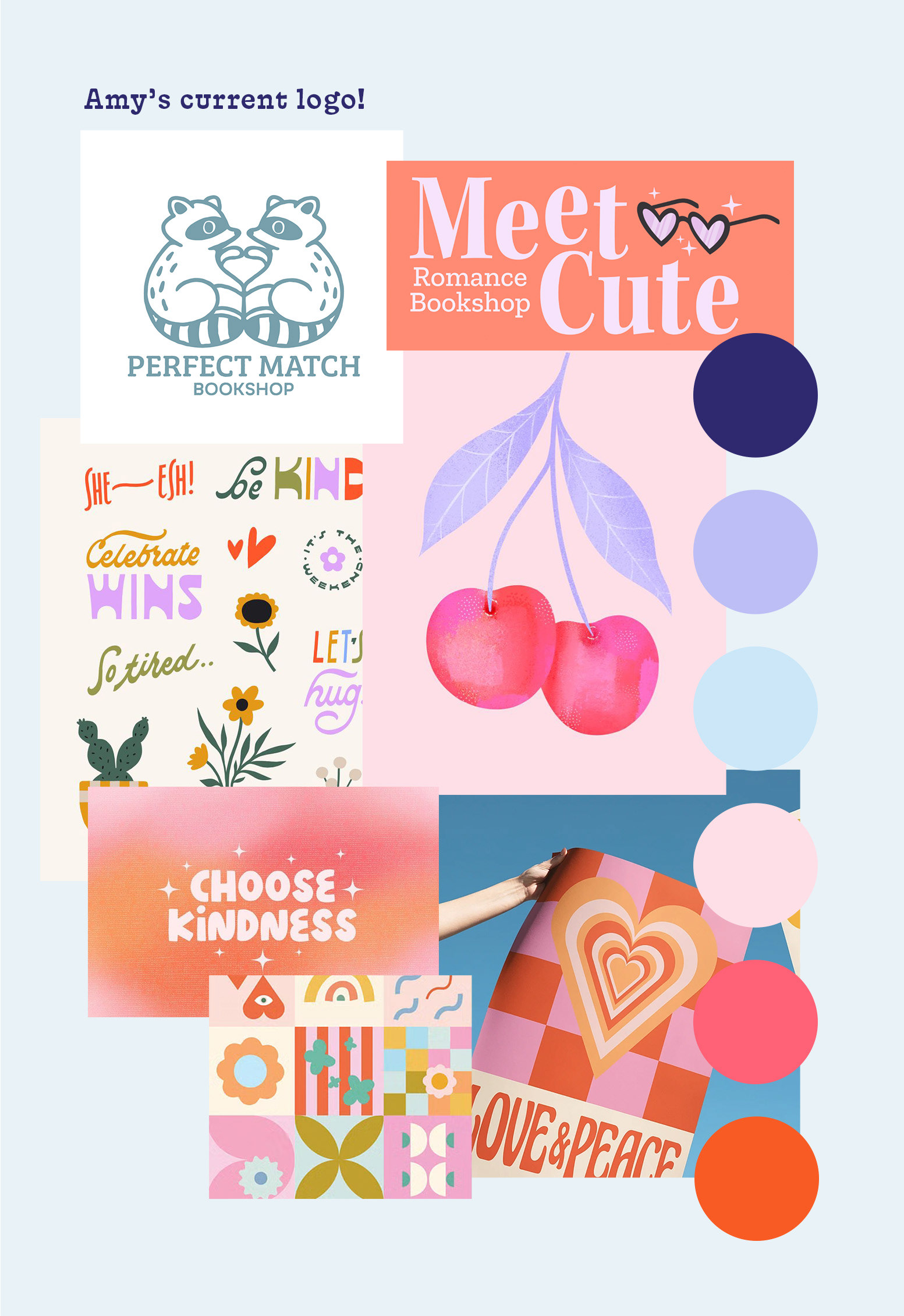
Amy came to me with a vision for Perfect Match Bookshop, a romance-forward, joy-driven space for women and queer readers, but the visual direction was still evolving. She brought a playful moodboard (hearts, friendship necklaces, florals, raccoons) and a clear list of what she wanted to avoid, no red, nothing too gendered, and no obvious matchstick references.
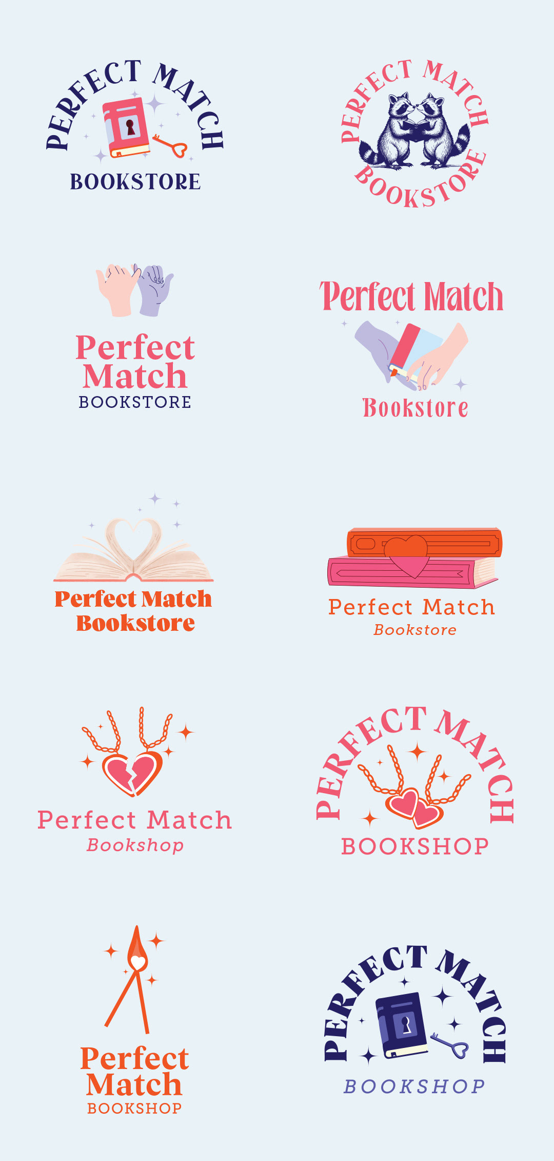
From there, we explored a range of directions, leaning into connection and storytelling, refining what felt right with each round. I still couldn’t resist exploring a matchstick concept.
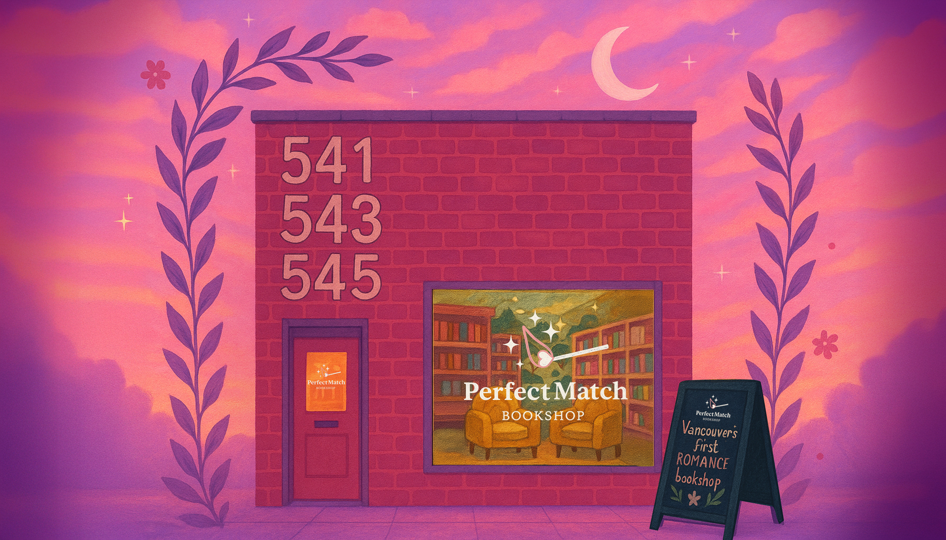
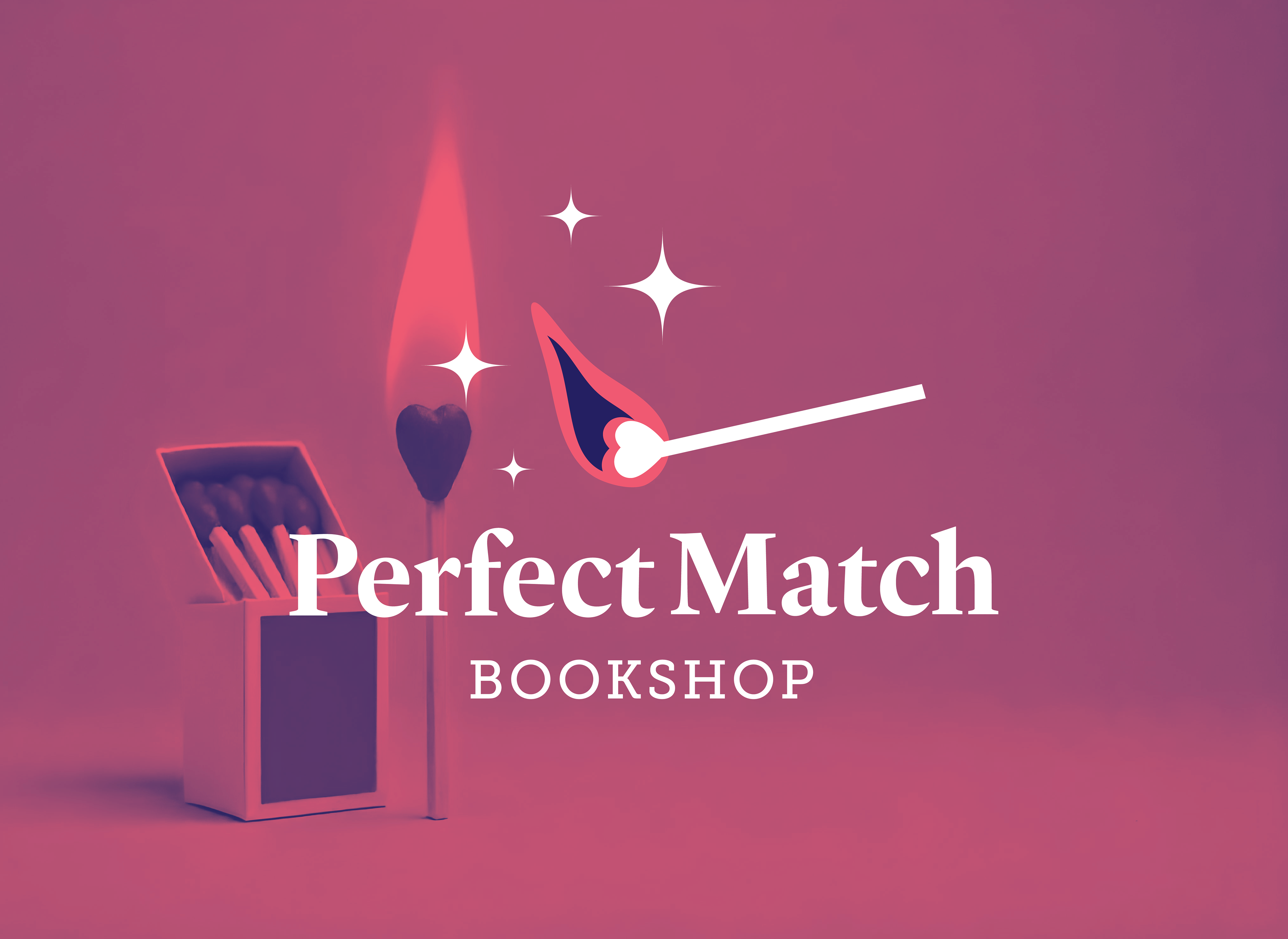
As it turned out, that reimagined matchstick, with a small heart aflame, became the one she fell in love with. The final identity feels warm, inclusive, and a little bit magical!